Secret Chiefs 3: Book of Horizons

Secret Chiefs 3 Book of Horizons Cover

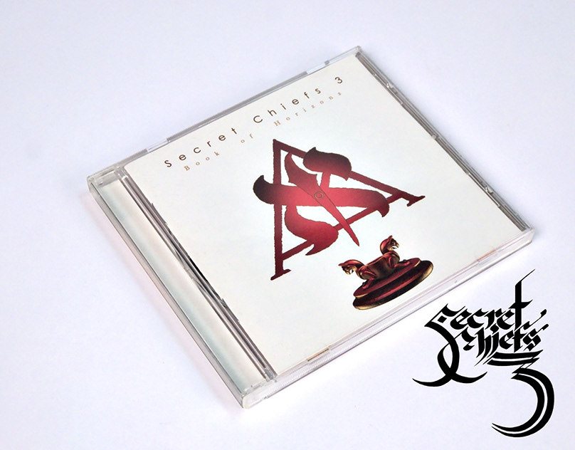
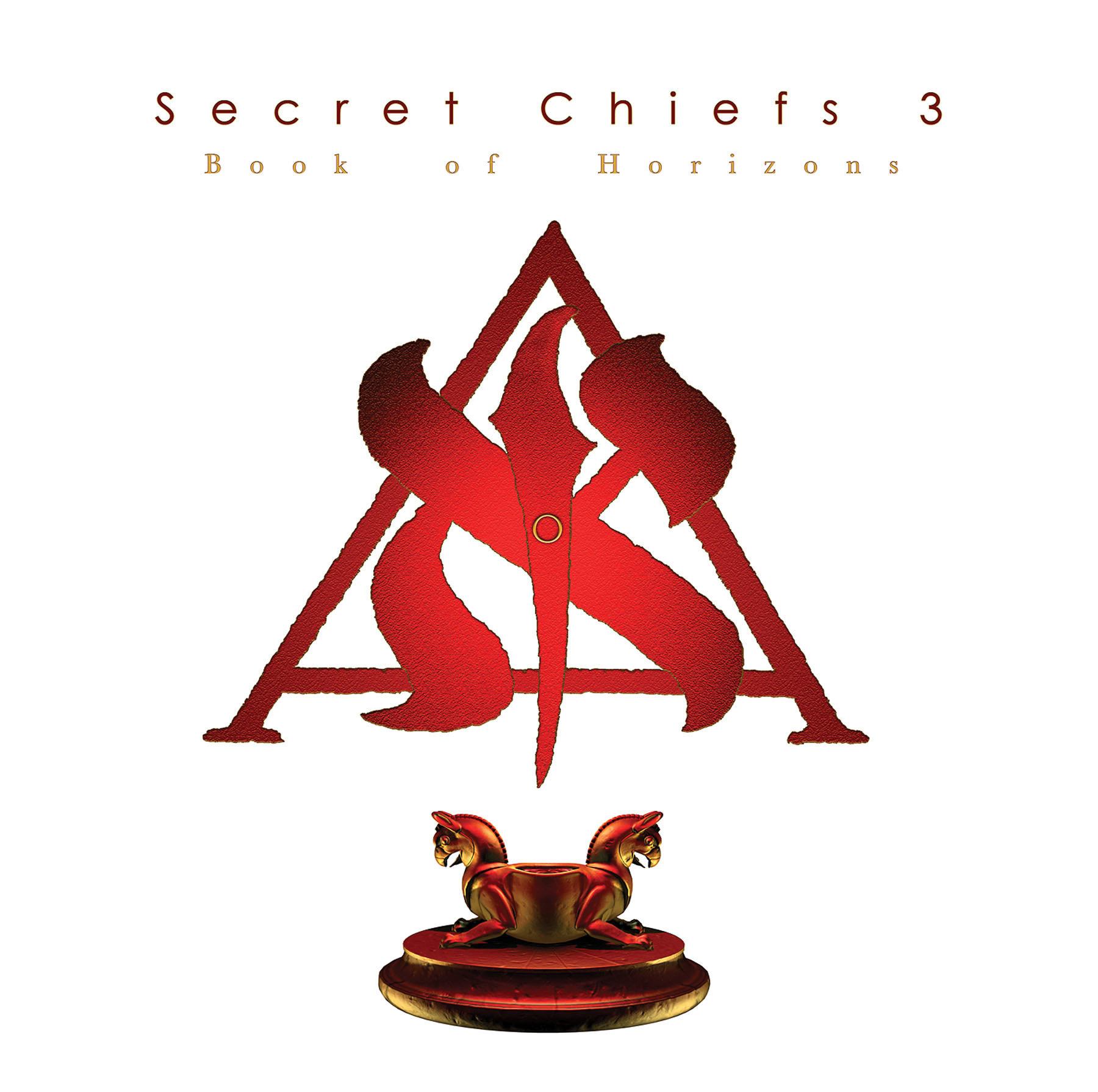
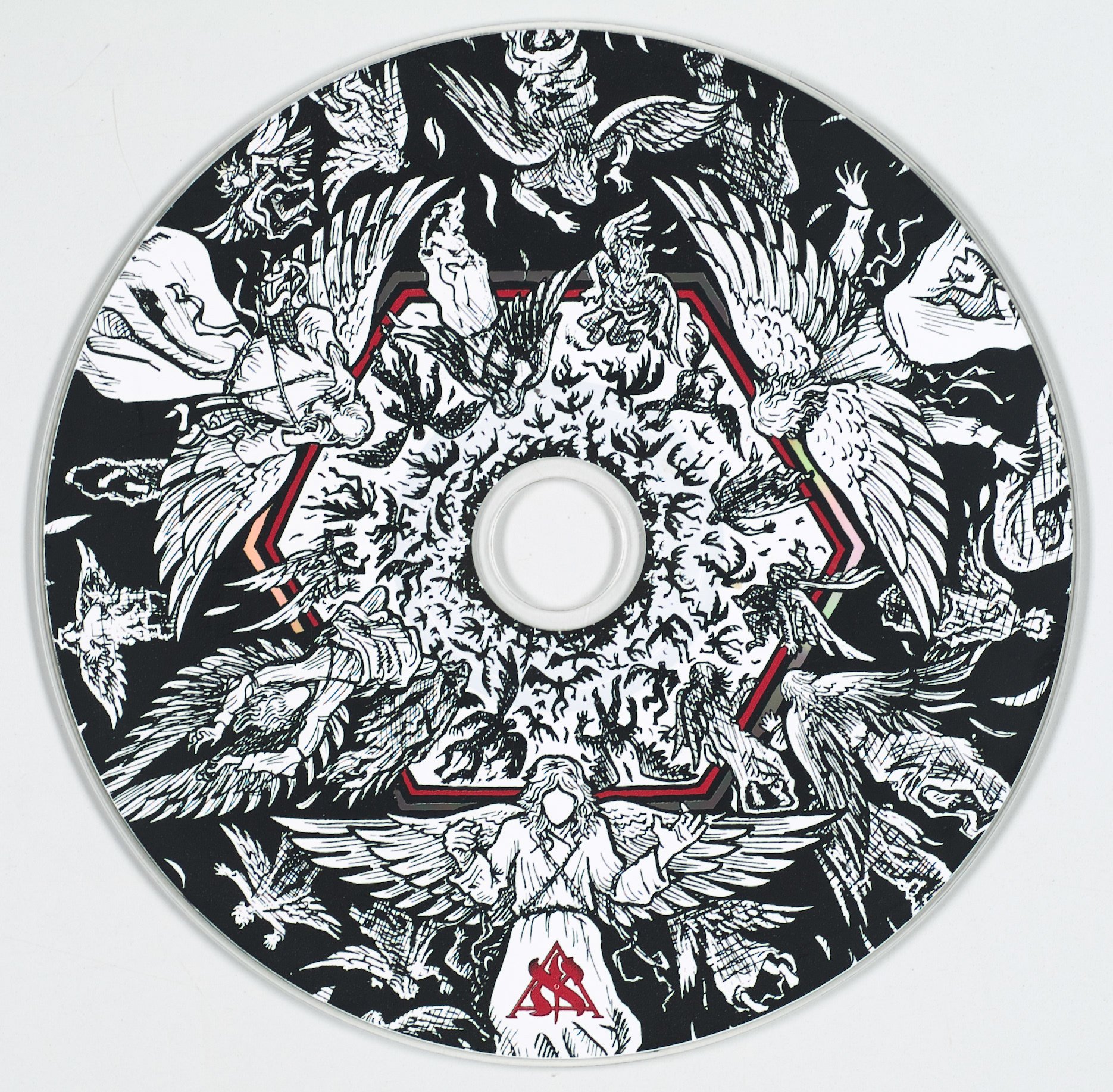
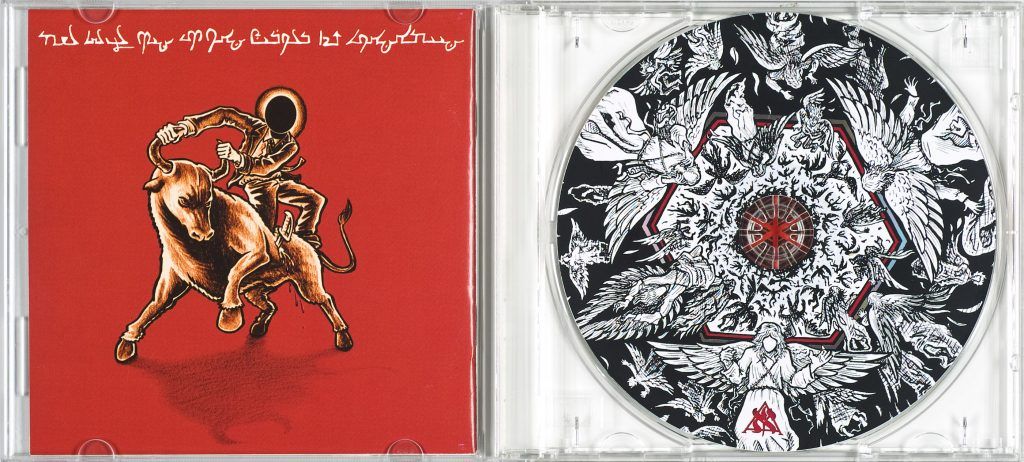
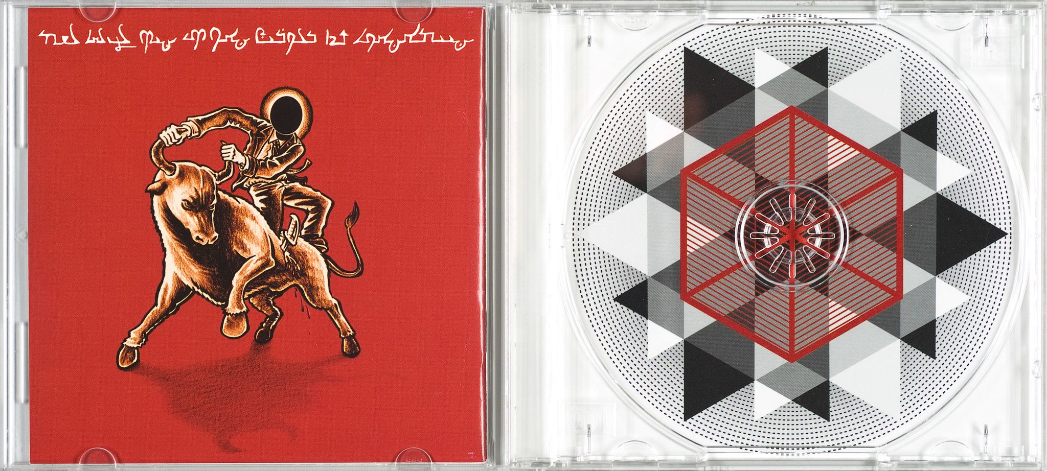
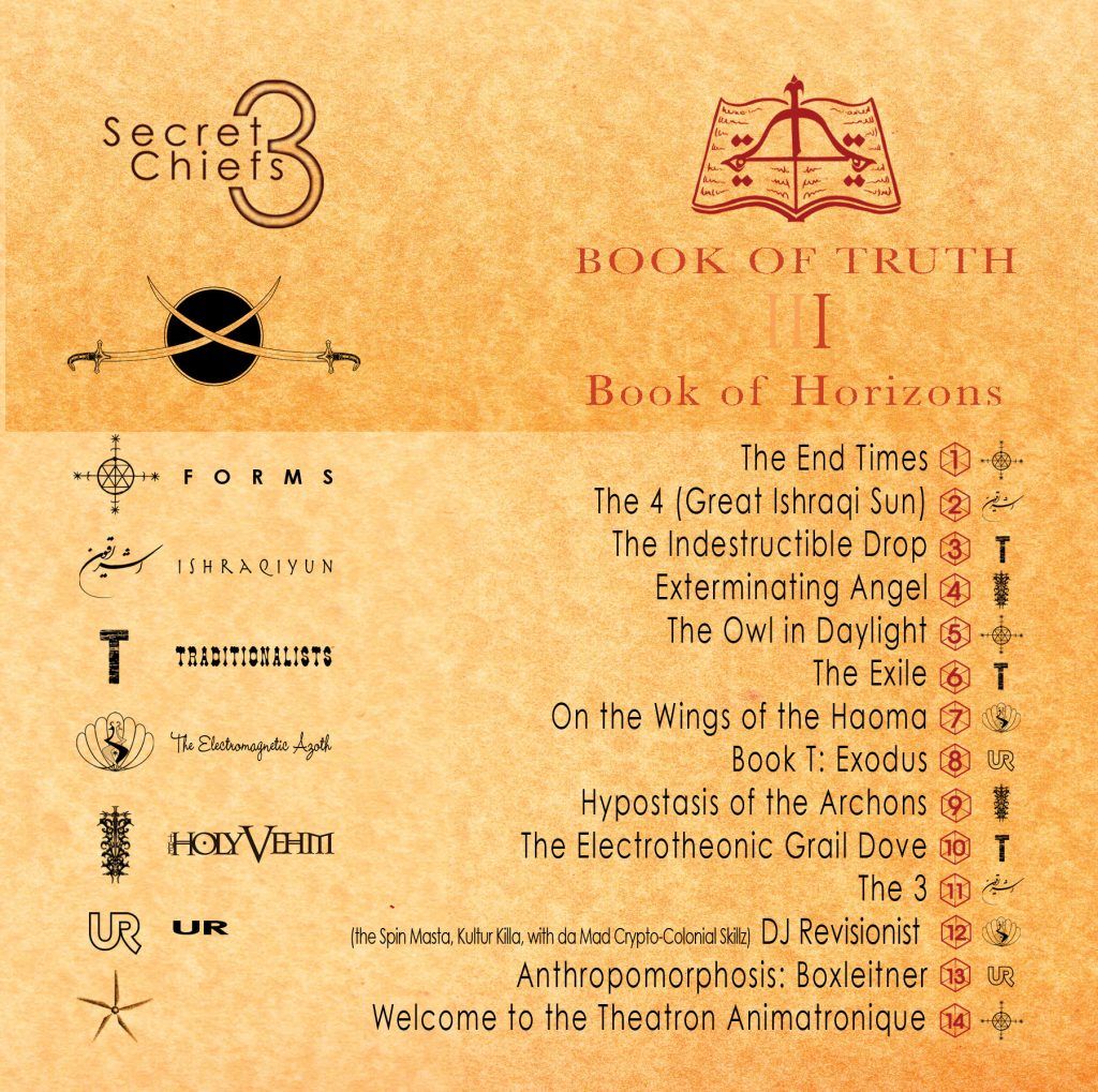
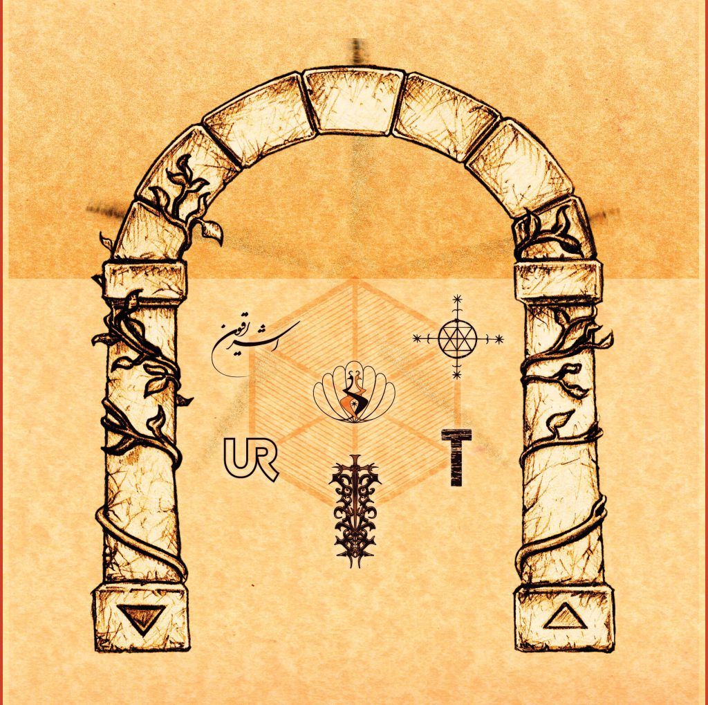
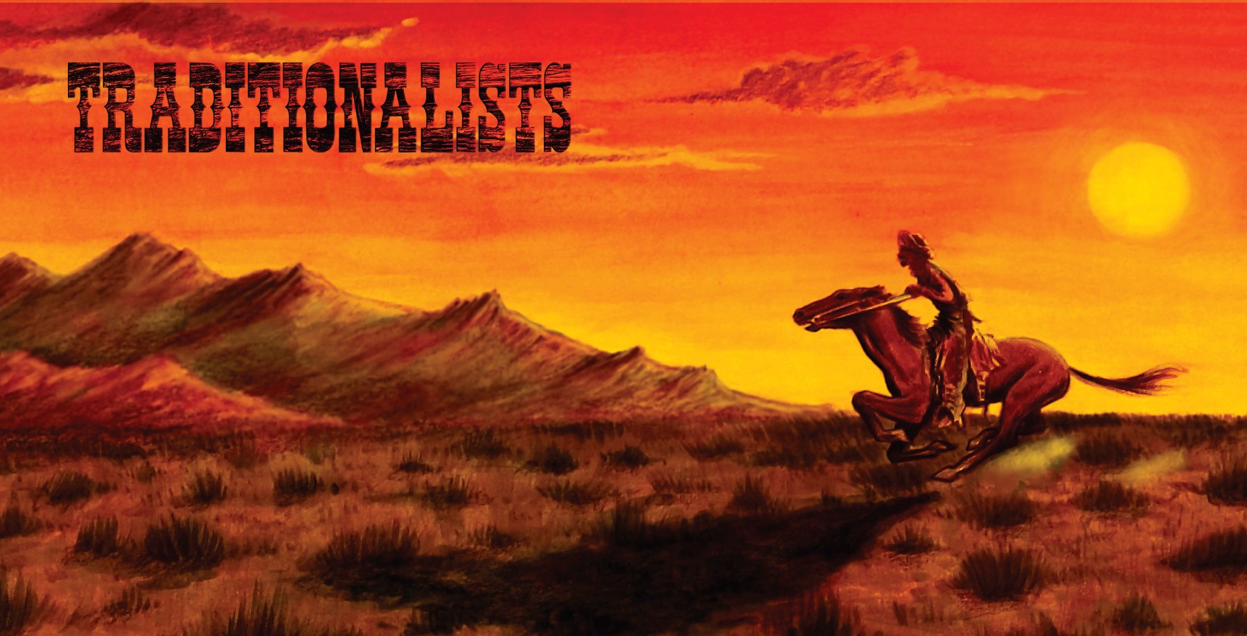
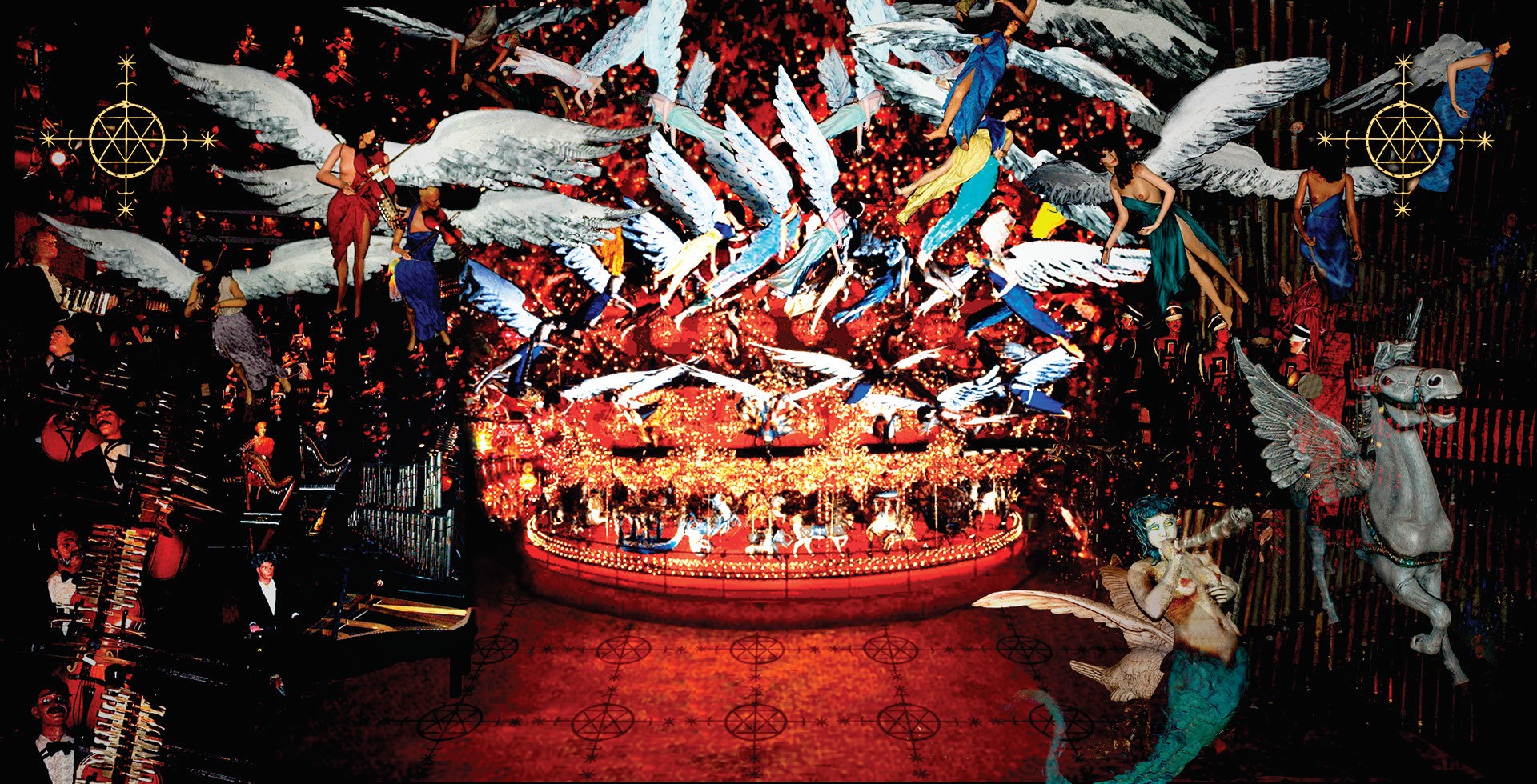
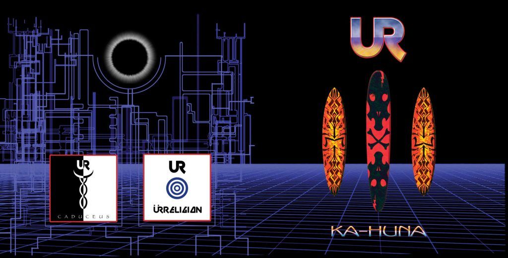
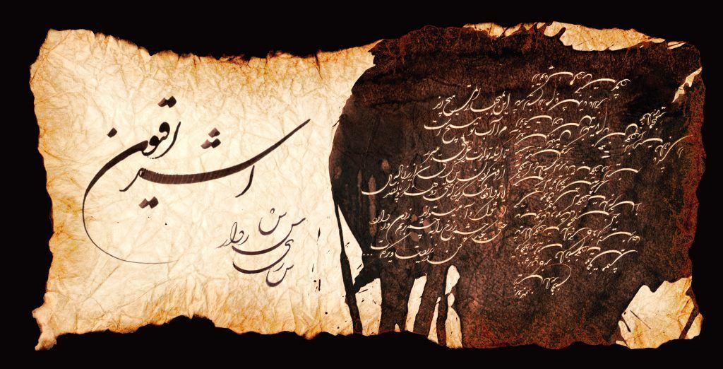
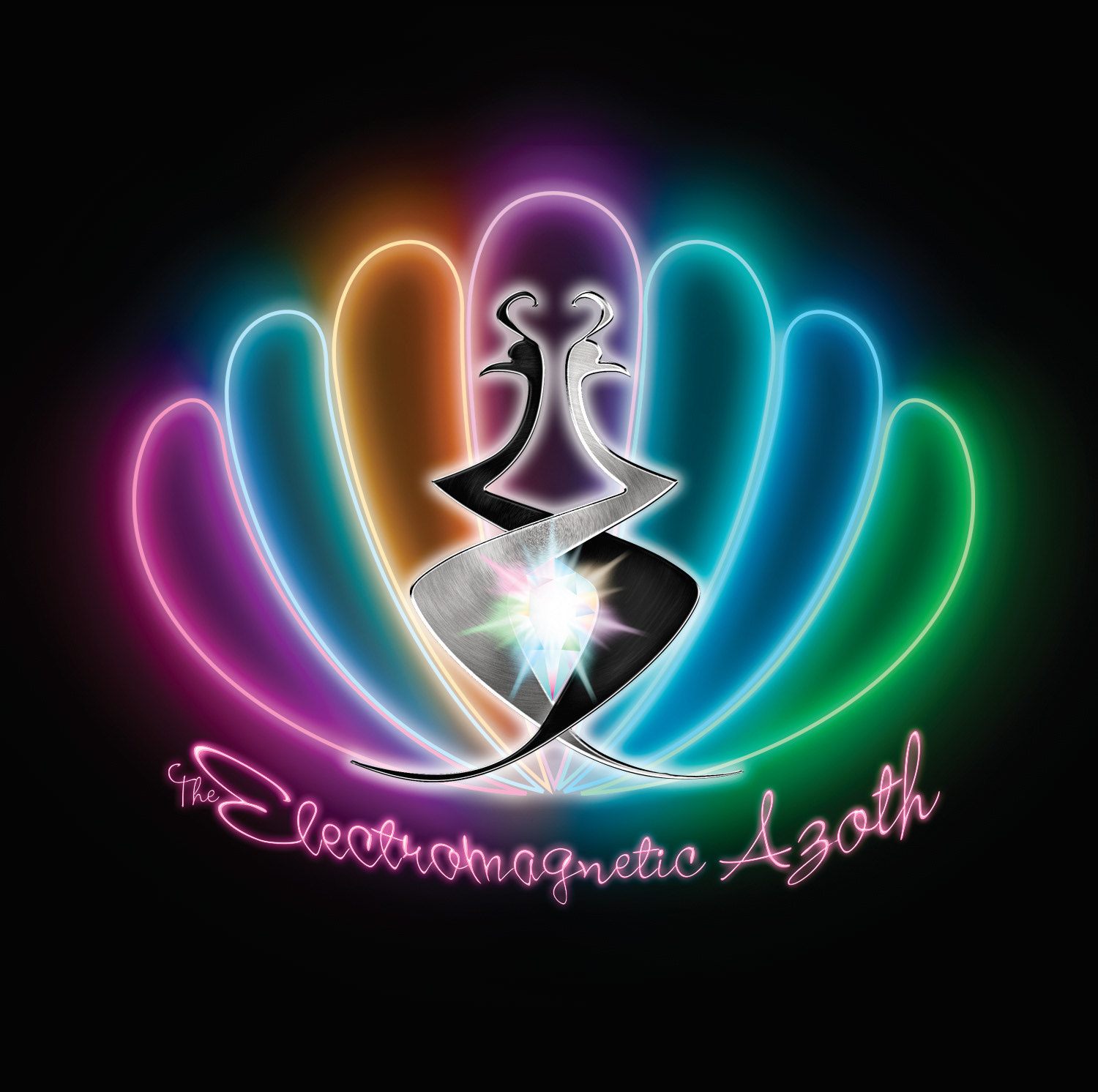
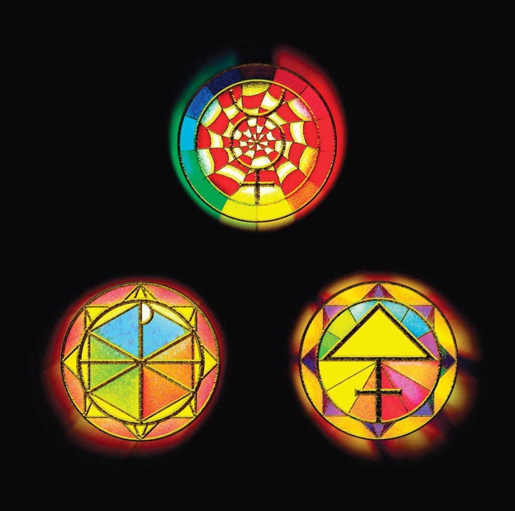
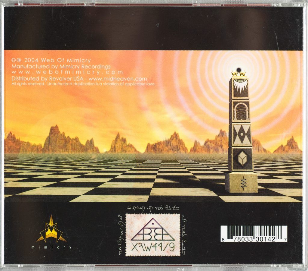
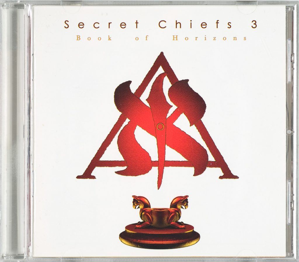
This was a complicated and elaborate project. I absolutely love this album and am very proud to have worked on it. Secret Chiefs 3 is a band that mutates constantly. Book of Horizons was the first release where the band was split up into “Sub-Bands. Each Sub-Band had to have it’s own logo and identity spread in the booklet that would also be used for subsequent releases. I did all the artwork for the release, except for three of the logos.The Holy Vehm Logo was drawn by Patrick Tremblay. I no longer know who did the Arabic calligraphy. Trey hired someone who was versed in the language. I’m credited under my real name, Mike Bennewitz, as this was before I was using any pseudonyms.Trey Spruance, the band leader, loaded these designs with esoteric concepts which he explained to me enough that I could illustrate the ideas, but not enough that I could explain them to you. You’ll have to ask him about any of that… 

The main Alpha/ Aleph / Alef graphic was created in Photoshop. The Haoma Bird statue at bottom was a 3D object I modeled and rendered.
This drawing sure took a long time. Ink on paper with some minor digital edits and coloration.
The open CD case with disk.
The open CD case without disk.
Band Logo Legend and Tracklist showing which band performed the song. I did all of the band name type treatments.
A diagram of each Sub Band’s logo.
Two page spread for The Traditionalists, the film-score focused sub-band.

Digital Collage of the House on the Rocks for the sub-band FORMS. FORMS logo by Trey Spruance.
I had a blast drawing this Holy Vehm page. Logo by Patrick Tremblay
UR is a Turkish Surf band. This is a poster from their 80’s period.
The band logo and text was drawn by a calligrapher I can’t find the credit for. I collaged it into the parchment.
I’m not sure if I’m supposed to give the name for this sub-band’s spread.
Fancy version of the Electromagnetic Azoth logo. Yes, it was supposed to be reminiscent of the NBC peacock.
Esoteric Stained Glass from the Electromagnetic Azoth spread. Digital Illustrations.
3D graphic built and rendered in Lightwave 3D.  The Mimicry Records logo I had made for the company previously. Even the weird postage stamp in the bottom middle was a complicated nuanced directive from Trey.
Vector graphic for under the CD.

The strange calligraphy at the top of the red panel was drawn by Trey Spruance. Font Used Baskerville
CD Jewel Case
Another view of the 3D graphic used as a background.

[custom-related-posts]